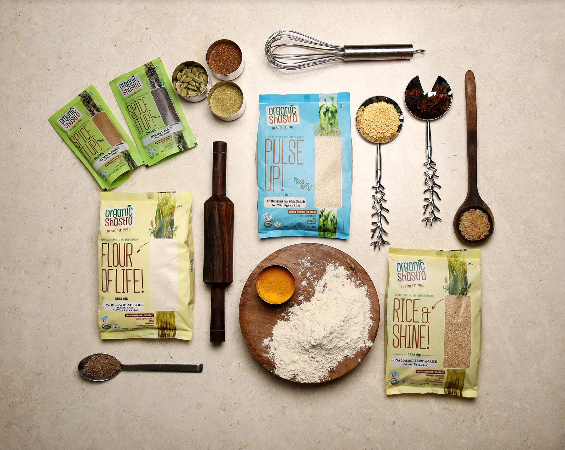
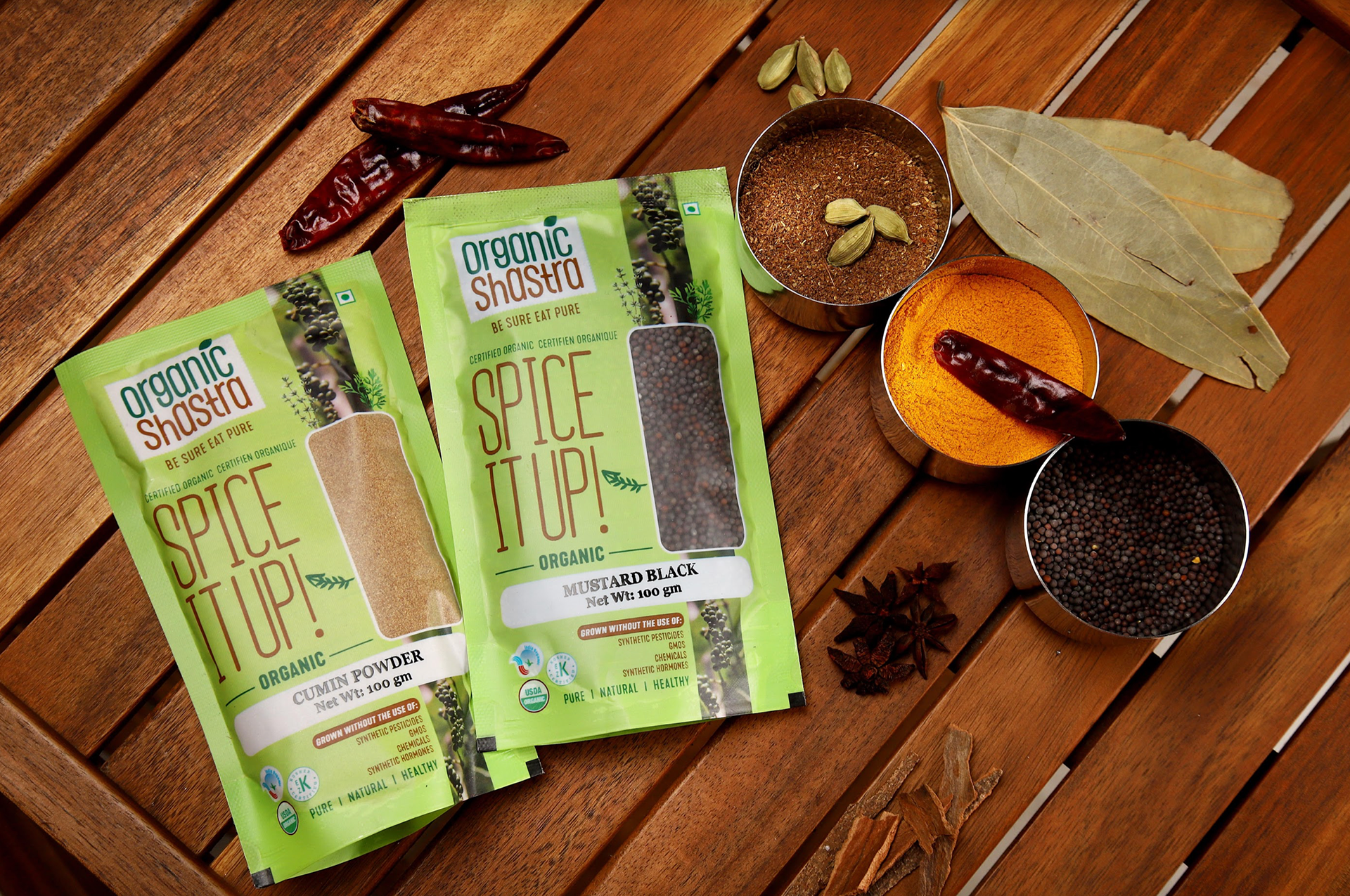
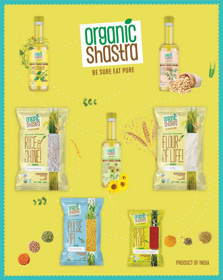
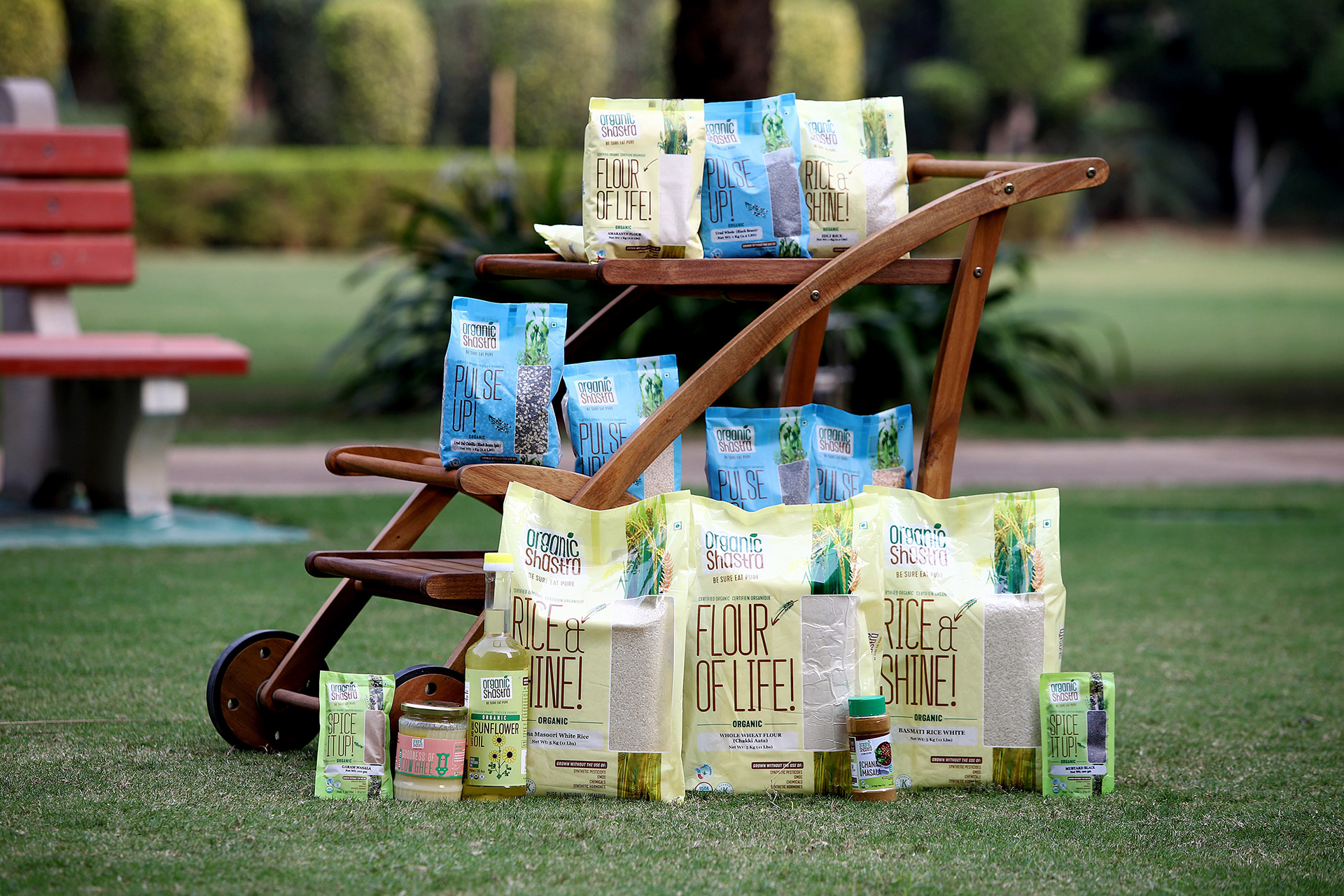
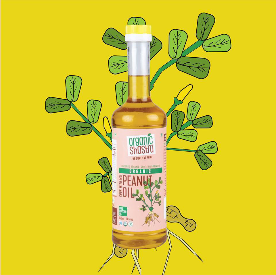
We created the logo and a new brand language that was likely different from everyone else in the seriously crowded organic food products aisle. Organic Shastra’s main goal was to stand out from the competition. Each design talks about the product and also refers to the daily life phrases.
As the products are of everyday use, the packaging reflectes the same that can be viewed from a further distance and easily recognised.